When designing a landing page for PPC, there’s a lot to consider. There are tons of features you simply have to implement if you want to make the maximum return on your pay-per-click campaigns. That’s why we’re guiding you through our landing page best practices and providing examples of company’s who are doing it right – so you can set your PPC campaigns up for success.
1. Keep your PPC landing page relevant to the keywords you’re bidding on
One of the best ways to annoy people searching on Google (and in general) is not delivering on your promise. I can guarantee most people will have had an experience online where they clicked a link in the search results and were left thinking “how have I got here?”. Make sure the PPC landing page matches the keywords that you are bidding on, and that the page matches the promise within the ad copy. If you are targeting users looking for ‘package deals to Mexico’, don’t send users to a ’25 reasons to holiday in mexico’ landing page. While in this example it might be relevant and have a call-to-action, it’s still just not what the user was looking for when they chose to click the ad.
A great example of matching a PPC keyword to a landing page perfectly is the JD Sports page coming up when searching for the phrase ‘buy mens adidas trainers’.
Search Ad:

Landing page: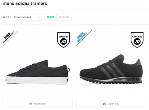
2. Write content for your target personas, not for the general public
When writing content and deciding on imagery, ensure you have at least 2 or 3 personas created so you can ensure the language and tone of voice matches your target customer. Very rarely will you be able to develop a PPC landing page that caters to every single audience – take a step back from the landing page and think “who am I hoping to land on this page?” and “what kind of language should I be using on this landing page?”. For example, say you’re creating a PPC campaign to drive new leads for your ERP software, there’ll be:
- People who already use ERP software who have sound technical knowledge and understand abbreviations such as SAP, MRP & ERP.
- New businesses who don’t know they’re looking for ERP, with no understanding of technical terms or abbreviations.
Likewise with imagery, you wouldn’t want to portray a technical ERP image that goes into great detail about systems integration for a customer who wants to discover if it’s actually possible to manage accounts, marketing and stock all in one package. This basic marketing premise should be at the forefront of your campaigns to ensure your landing page content is tailored for your target customers and you’re not using a ‘one size fits all’ approach.
3. Write a headline so strong the user can’t do anything but convert
The first thing a visitor sees when they land on your page is the headline. When you’re creating a headline, make sure to include a keyword theme that ties directly back to the ads you’ve written. Usually you won’t be able to have the exact keyword the user has searched within your headline so, review your keywords, group them into themes and build your headlines around them.
Once you’ve got your keyword themes, think about why a potential customer who’s never heard of you will want to stay on your page, engage with your content and ultimately reach out. Your headline should:
- Be straight to the point – avoid metaphors and cut the waffle.
- Be relevant to the keyword theme you’ve identified.
- Empathise with the visitor – address their problems and provide a solution.
FreshBooks’ PPC landing page is a great example of using an effective headline – it’s straight to the point, problem solving and keyword relevant.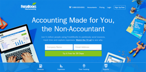
4. Use unique imagery that will connect with your target personas
Imagery plays a huge part in PPC landing page performance. It should help communicate what’s on the page, why it’s beneficial and what the visitor’s going to get out of it. Research shows that visitors respond best to landing pages that contain human imagery – the more realistic the better. Avoid using stock images unless you’re absolutely sure they’re relevant.
For product based landing pages, include detailed interactive photographs that increase attention and drive the visitor to find out more information. Ensure your images are compressed, avoid using very high resolution images and choose the best size for your landing page – test on all devices and optimise accordingly.
Another point to consider is the amount of imagery you’re using. Avoid filling out the landing page with multiple images as it might cause confusion and direct attention away from your content. Sittercity uses human imagery effectively on their babysitting PPC landing page. Rather than opting for a stock image of a baby they’ve chosen to use a professional image that portrays trust and subtly directs the user towards the CTA.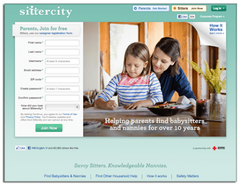
5. Strategically position your landing page elements to drive conversions
Neil Patel defined the key elements of a landing page as:
Top of page:
- Headline
- Subheadline
- Image
- Video
- Brief Copy
- Call to Action
- Trust Signals
- Explanation of the product or service
- Benefits of the product or service
- Testimonials
- More CTA
Bottom of page:
There is never a one size fits all approach when developing PPC landing pages. However, treat the above as a ‘what you want the visitor to see first’ list. Introduce the product/service, visually explain the offering, solve the visitors problems with the copy and then push them towards taking action. A fantastic example of this methodology can be seen with Smartsheet.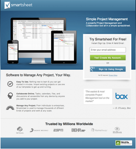
6. Use your PPC keywords as the fuel for your landing page content
Keyword driven content on PPC landing pages is not just for the benefit of search engines. When you set up search campaigns you focus on tightly themed ad groups that target a set of keywords. When writing your content, refer back to these keywords to ensure you’ve covered all angles.
By no means should you start stuffing PPC keywords into the content. Instead, take a strategic approach to ensure you’re offering value to all users when they visit your new landing page. For example, say you’re selling ERP software and are bidding on stock control related keywords; within the content you’ve covered every feature (marketing, accounts, CRM) but have neglected stock control, the visitors who found you through a stock control related keyword will be lost – not only creating a missed opportunity but also driving up costs.
7. Include trust signals to create an emotional connection with users
Trust signals play a huge role in the conversion process. When a new visitor is deciding whether or not to reach out, you can strategically include features about your business to gain the visitors trust. There are many different types of trust signals. A few common ones are:
- Testimonials and reviews
- Contact information
- Accreditations
- Payment assurance
- Performance figures
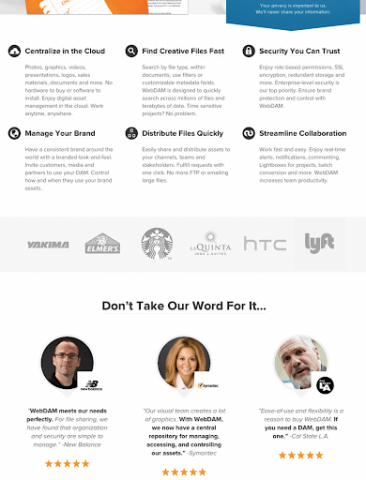
There’s no ‘one size fits all approach’. Refer back to your personas and formulate a list of what your ideal customers would respond to best. Is it facts and figures? Is it heartwarming testimonials? Or maybe a combination of both? Trust signals are a great way to connect with your visitors and require just as much care and attention as the landing page design. webDAM makes great use of trust signals, including: ‘who we’ve worked with’ logos and a visual testimonials section using human imagery.
8. Prove your worth with shares, case studies, reviews, followers and more
Word of mouth is very powerful – people make decisions based on what other people say. Social proof is the 21st century update of word of mouth. When a new visitor arrives on your landing page they want to know what other people think about your product/service.
There are many indicators of social proof that you can add to your landing page:
- Case studies
- Social shares/likes/followers
- Embedded social posts
- Number of users/downloads
- Reviews
Visibility is key. Being open to new visitors with your social channels gives them the chance to explore what people have been saying about your business first hand. Case studies are also a fantastic way to add social proof as you can tell a complete story that puts the visitor in the shoes of previous customers who’ve had a great experience with your brand. When writing case studies, consider the personas you’ve created and tailor to them accordingly.
9. Ensure the length of your PPC landing page matches your overall goals
The length of your landing pages directly affects how well visitors convert. Typically, there are two types of landing pages – short and long. Both have their own advantages and choosing which one is for you comes down to a number of factors. Here are the key points for both short and long landing pages:
Short landing pages:
- High volumes of lead generation, typically less qualified.
- Ideal for low commitment actions.
- Perfect for offering free resources.
Long landing pages:
- Produces less leads than short pages, typically better in quality.
- Bigger page = bigger ask.
- Suited for product landing pages.
Here’s an example of a great short landing page from Salesforce, this page is straight to the point and is geared towards getting new visitors to sign up for ‘free demos’.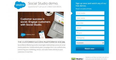 Pear Analytics have a good example of how to utilise a long landing page, this page builds trust by offering a detailed breakdown of the service using really great visuals.
10. Create compelling call to actions that are effortless to complete
Getting a visitor to do what you want them to do is not easy, whether it’s downloading an eBook or sending contact information. Your call to action should be the first thing that a visitor sees when they land on your page – the more obvious you make it the better the chances of converting are.
You should consider:
Visuals/Colours
- Contrasting colours work great on buttons, helping them to stand out and draw the eye of the visitor; e.g. if you have a blue background, try an orange button for your CTAs.
Wording
- The wording of your CTA is super important. Refer back to your personas – what would drive them to take action? Are you aiming for lead generation? Sales?
Sizing
- Use your initiative when deciding on the sizing of your CTAs. You want it to be big enough for the visitor to remember, but not so big that it distracts them from absorbing your content. Testing out different sizes is a great idea – monitor your analytics and tweak accordingly to improve performance.
Prominence
- Ensure your CTA is as visible to the user as possible. Make sure it’s the very first element of the landing page, keep it above the fold and if you’re creating a longform landing page, add multiple CTAs as the page progresses.
Direction
- This is where it gets interesting, the direction of your CTA in relation to your imagery can have a direct impact on conversion rates. A popular tactic is to use directional cues towards your CTA. Kissmetrics have a great example to show how a small cue can directly affect browsing patterns, take a look at the following page and notice the shift in user action:
Before:

After:
- Give them no other option
- Offer freebies, no obligation quotes, and samples etc. These extras could be the deal breaker when a visitor is thinking about reaching out to you. Visualise your landing page like a physical store location – you would be immediately put off if you walked into a store and a sales person came straight over to shout: “BUY NOW”. Whereas, if you were approached in a more gentle manner and offered some free advice – a month-long trial perhaps – you’d be more receptive, right?
11. Don’t miss an opportunity, make sure your landing page is optimised for mobile
When you’re designing your landing page make sure it’s mobile friendly. Whether you have a separate mobile landing page or use responsive design – treat mobile with as much care and attention as you do desktop. When you are paying to send traffic to your site you want to get the best ROI, and by neglecting mobile you will be seriously limiting the success of your campaigns.
In addition to the performance benefits of having a mobile optimised landing page, you’ll be able to tailor your CTAs to make it easier for the visitor to reach out. A basic example would be to swap a form on a desktop for a click to call button on mobile devices. If calls aren’t on your agenda, try to ensure your form requires as little typing as possible – have a specific mobile form to reduce friction, collect the very basics, and then follow up afterwards.
12. Avoid leaving your users waiting; deliver lightning fast page speed
Page speed is a critical success factor within the conversion process. If you’ve paid to drive traffic to your site then you can’t afford to have them waiting around. A study by Kissmetrics found that every 1 second delay in page speed results in a 7% drop in conversions – a serious dent in performance. Best practice for page load is 3 seconds and below. You can check your page speed with Google PageSpeed Insights (anything below 85 needs to be investigated). Some common factors which could improve page speeds are:
- Compressing images, HTML, CSS and JavaScript content.
- Minimising the number of plugins & widgets.
- Avoiding unnecessary DNA lookups.
- Reviewing the hosting package you are currently on.
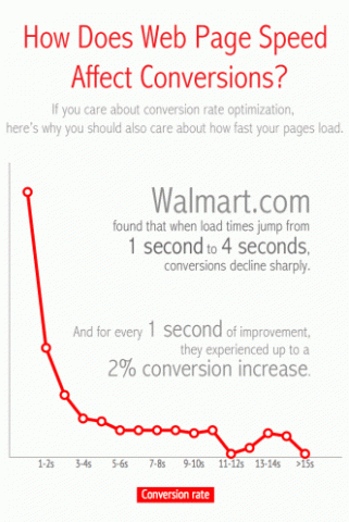
Speeding up your landing page is a great way to improve conversions and will pay dividends in the long run. A fantastic example of how page speed can affect conversion rates can be seen within this infographic case study from Walmart, courtesy of Web Performance Today, they found that a 1 second improvement in page speed resulted in a 2% increase in conversions:
 13. Eradicate distractions: keep your PPC landing page focused
Imagine, you’ve put blood, sweat and tears into creating your landing page, the last thing you want is to send visitors off on a tangent and distract them from your amazing product/service. Take a step back from the landing page and ask yourself: “does this page follow the rule of one?” – one purpose, one CTA and one point of focus. Look out for: links (even to your own website), excessive information, boring copy, navigation bars/menus, lengthy form fields etc.
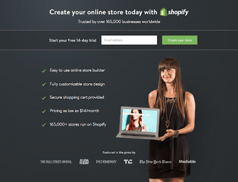
It may seem like a missed opportunity to leave out your navigation or not refer to your other services, however, the benefit of this is that you have a clear focus on the goal you want to achieve. If you’re bidding on specific keywords and visitors are losing interest/clicking off the page, then your CPA will increase. Try to use bullet points and trim text down as much as possible. Have a clear idea in your mind of the end goal of each piece of content. Shopify do this really well, utilising 4/5 word bullet points, avoiding external links and focusing directly on the CTA:
14. Never act on a hunch! Use analytics to drive strategic decisions
Google Analytics should be used to track the performance of your landing page and inform any strategic decisions you make. And since Google Analytics is being replaced by Google Analytics 4, then it makes sense to talk only about GA4, as it’s a new platform and quite different from Universal Analytics. What was previously called a goal in GA, is now called conversion. So make sure you set up a conversion for your CTA – this can be a destination page, event (eg. played video), duration, click to call etc. But first, you need to create an event, or use one of the recommended events, using the very same page you want to track, and then mark the event as a conversion. It may sound confusing, so let’s take it step-by-step.
A basic event for a landing page would be a form submission, and you can track visits to a thank-you page URL or use event tracking to record every time a button is clicked. When you have your events, you need to go to Conversions and add the event as conversion. Once you have your conversions set up you’ll be able to run reports and see conversion data within Google Analytics 4, perfect for monitoring top level performance. You can also look deeper into page performance using the following reports:
- Avg. Engagement Time: the average length of time that the website had focus in a browser.
How to: Reports > Engagement > Landing page
2. User/Session Conversion Rate: the percentage of users/sessions that triggered a conversion event.
How to: Reports > Engagement > Conversions > Pencil icons (Top-right corner) > Add session/user conversion rate
3. Device Categories: the type of device (desktop, tablet, or mobile).
How to: Reports > Tech > Overview > View Device Categories
GA4 gives you endless opportunities when it comes to reporting. Just visit the Explore page, create a blank report and build any custom reports you need; the sky really is the limit.
15. Test and test again: optimise your PPC landing page to drive conversions
Once you’ve nailed your landing page, followed all the best practices and have your campaign running, do not sit back and think your work is done. Even if you’re receiving conversions, this is the best time to start delving into your data and looking to improve your performance. Take the list of best practices and run through them systematically to ensure you’re getting the maximum ROI from your landing pages. A/B testing is an absolute must with PPC campaigns as it allows you to test various elements and see whether this has a direct impact on your conversions.
Avoid acting on hunches at all costs! If you think a form needs changing or an image needs moving, make sure you have statistical analysis to back this up and split test before making any permanent changes.
Key takeaways
PPC landing pages are unique as you’re paying for the traffic. Following best practices is a must and acting on hunches will limit your potential to collect leads/sales/enquiries. Here’s a quick summary of the elements you should be taking into account:
- Relevance between keywords and landing page
- Write for your target personas
- Develop a killer headline
- Hand pick imagery that will connect with your personas
- Position your PPC landing page elements to convert
- Drive the content with your ppc keywords
- Use trust signals to put the user at ease
- Take your best social proofs and spread them wisely
- Chose a landing page length that suits what you want to achieve
- Spend time developing bulletproof call to actions
- Optimise your PPC landing page for mobile devices
- Work towards a 3 second or less page speed
- Follow the rule of one, offer no distractions
- Use analytics to support for all strategic decisions
- Test, test, and test all elements
If you’re at the development stage or are currently reviewing your PPC landing pages, we can offer expert consultancy and account audits to help get you on the right path. Get in touch with us.


