What does website conversion rate mean?
Conversion rate refers to the % of visitors to your site that complete one of your desired goals or actions, such as making a purchase, filling out a contact form, clicking to call, or signing up to an email newsletter.
It is calculated as a percentage by taking the total number of completed actions/goals over a period and dividing that with the total number of visitors.
For example, if you gain 1000 visitors to your site, and 10 of them complete a goal, then the conversion rate is 10/1000 = 0.01, and x 100 = 1%.
Why should you invest in conversion rate optimisation (CRO)?
The benefits of CRO are obvious – rather than spending money driving traffic to your site through paid, SEO and social channels, why not make more money and gain more leads from the traffic you already have?
Then, once you start to become more profitable through CRO, you can invest that back into driving more traffic to your higher-converting site.
How to improve website conversion rates
Getting your website to convert traffic into potential customers is a crucial measurable goal for any website; removing barriers and making things easy and obvious to your visitors is the key.
We’re sharing six website conversion tips to increase your conversion rate and boost the success of your website.
1. Use active language on buttons
Getting your calls to action right is the most basic but important thing you can optimise on a website. They will typically appear on most pages, and will always be a key part of the buying journey, so maximising the clicks on your main calls to action is important, but also one of the simplest and quickest ways of increasing conversion rates.
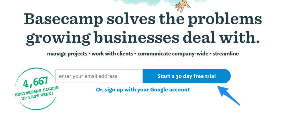
Using active language instead of generic, passive language on buttons can greatly improve engagement rates, and lead to more sales and conversions. For example:
- Change “Read more” to “View product details”
- “Store Finder” to “Where to buy”
- “Product categories” to “Discover more products”
- Avoid using generic words like “Submit’ or “Send” – try “Send my message”
By giving your user a snippet of what to expect when they click, they’re more likely to interact with a button.
In this case study of the Black & Decker ecommerce store, experimenting with the language of the primary button on the product page saw double figure increases in click rates, simply by experimenting with the language of the ‘add to cart’ button with several variants. The idea behind the experiment was that ‘Shop’ sounded less committal than ‘Buy’, and would encourage more site visitors to click through.
This approach is also endorsed by Google themselves, with a whole section in their UX Playbook for Lead Gen dedicated to this topic. They encourage site owners to avoid generic calls to action, and making CTAs more descriptive, which according to them has the following benefits:
- Links will be more accessible.
- Links will be more enticing to users and potentially more persuasive.
- Users will feel more confident as they click from page to page.
- More keywords on the page will help search-engine optimisation.
- Meaningful links will stand alone and help users who are scanning the page.
2. Ask for smaller commitments
In their Playbook, Google also highlight that we shouldn’t rush our potential customers into commitment, with the following advice:
- Most people are commitment-averse
- Don’t ask for a commitment when you can delay it
- The best example would be ‘buy now’ vs ‘add to cart’
- When ‘buy now’ seems awfully final, ‘add to cart’ seems kind of risk-free and leaves the door open for changing the mind
Essentially, your customer may be interested in your product, but may not be ready to buy or make a decision. Asking smaller commitments from them can be useful, especially in consultative situations – for example a service company or bigger, more expensive products that need more consideration.
When taken into account alongside using active language, you can create a less intimidating proposition for website visitors by either offering softer alternatives to a purchase, or simply asking for less commitment.
As an example, try changing “Buy now” to “Speak to an advisor” or “Speak to us about a free consultation”, which reassures the customer that the next step before a decision will be a conversation, not a transaction.
In this test by Oskar Zabik, changing the main call to action to “Contact Seller” from “Buy now” resulted in a 73% increase in conversion rates.
3. Focus on where you convert best
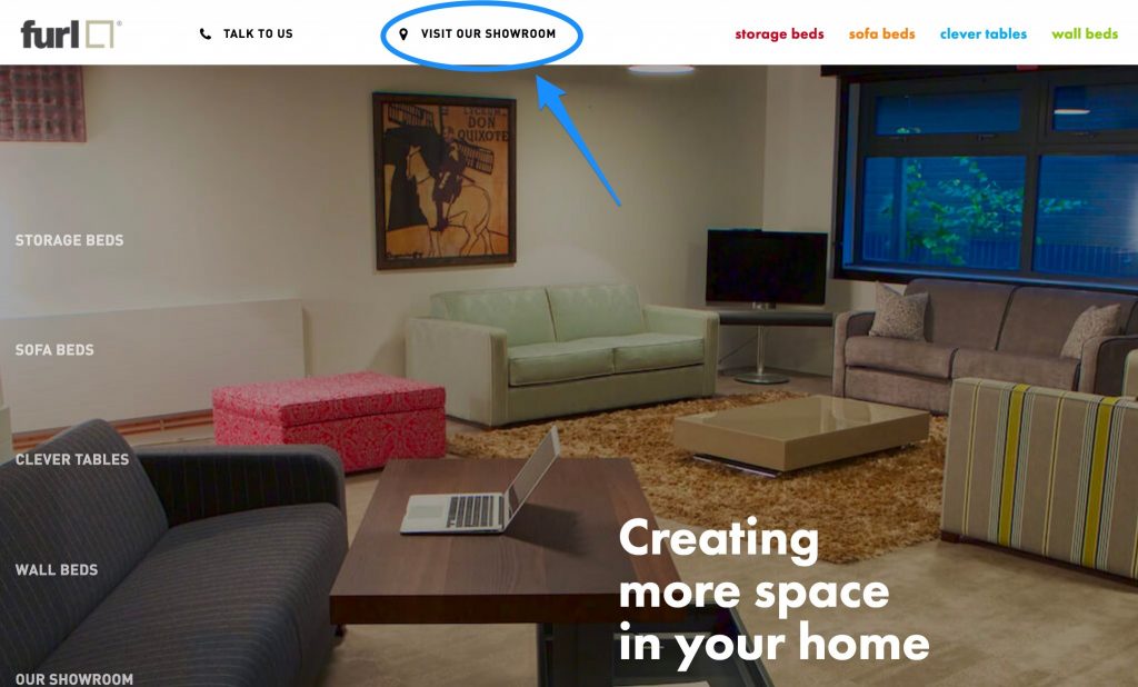
In some cases, buying online is certainly possible, but sometimes the best route is to get your customer face to face, or physically in front of your product.
In one Hallam project for a client who manufactures high-end furniture, we identified that they had an 80% conversion rate of all customers who visited their showroom to try their products. As a result, the site’s conversion strategy focused on driving customers towards making appointments to visit the showroom, and to use contact forms as a secondary method.
This resulted in a sharp increase in visits to the showroom, which has led to a big increase in footfall to the physical store, and a higher number of sales as a direct result.
4. Contact forms should set expectations
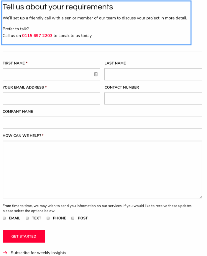
For many service businesses, the contact form is your primary route for contact. Filling out a contact form can be quite a commitment for a prospective customer, so it’s important to remove as many barriers as possible, by providing reassurance of what’s going to happen next.
One example of this is our own website – we included a promise of what will happen after you contact us: we’ll set up a friendly call with a senior member of our team. By clearly setting out expectations and describing what will happen next, we removed a potential barrier that resulted in higher quality of leads, with clearly defined messages from the enquiry. If possible, you can provide an alternate way to contact you, in this case, we direct people to get in touch by calling our phone line. As a bonus, include a guaranteed response time, if possible.
Using a natural, conversational tone in your contact forms can lead to an increase in conversion. This type of form can appear more friendly, and seems less intimidating even though it’s asking for five separate pieces of information, all of which is sensitive and private.
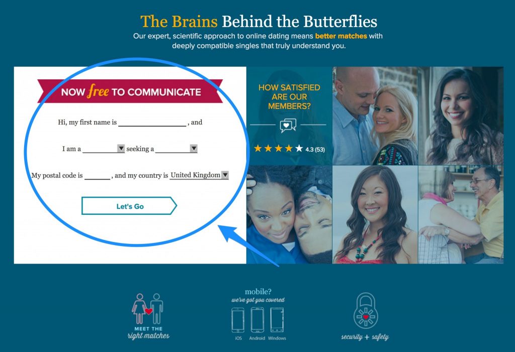
This approach removes some of the barriers associated with forms, and provides a different, fresh approach that can spark curiosity and interest in your potential customer. In the case above, it provides an engaging way to proceed further through the site, without committing to any specific outcome.
Be warned, it doesn’t always work – in this test by Embrace Pet Insurance, a conversational approach led to a drop in conversions. Tread carefully!
Read our blog for more tips on how to create great online forms.
5. Expose your key navigation
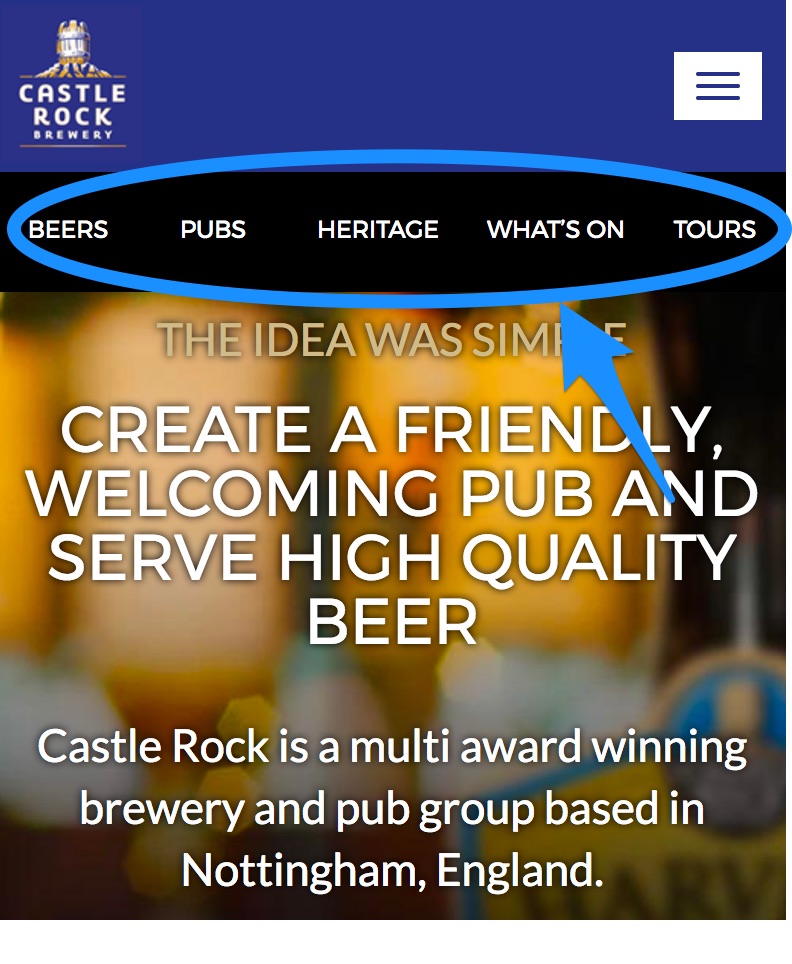
Just like with active language on buttons, it’s important to always provide clickable options that customers can quickly and easily understand, and avoid guesswork or confusion.
For example, if your website sells products online you should display as many product categories directly in the main navigation, instead of putting in a “shop” dropdown menu. If you have key services, promote them to the main navigation and give them as much exposure as possible, as they are likely to be instantly recognisable to your target audience.
This also applies to mobile, where space is at a premium. Although it’s inevitable you’ll need to hide some navigation behind a “burger menu”, it’s good practice to expose your primary actions at all times.
In a case study for Nottingham’s Castle Rock Brewery, exposing the primary navigation items led to a big increase in engagement on mobile devices, and increased traffic to key pages.
As you can see, there are many design, copy and UX elements that you can test out on your website to increase your website conversion rate. If you’re keen to learn more, take a look at our 15 proven design patterns for better UX. If you gain the required traffic levels to your site, we would always recommend testing out significant changes on your site to ensure they do in fact improve conversion rates before permanent implementation through a CRO programme of AB or multivariate testing.
Want to find out more? Get in touch with our team of creative and UX specialists today on 0115 940123 or fill out our contact form.
