![]() Whilst many online businesses focus on bringing in extra customers to their websites, they often ignore small changes on the website which could convert more current visitors into customers.
Whilst many online businesses focus on bringing in extra customers to their websites, they often ignore small changes on the website which could convert more current visitors into customers.
One of the most ignored features on an ecommerce site is the internal search functionality, usually located at the top of the webpage. When visitors know what they are searching for or they want to look at a specific range or type of products then they’ll use the search bar instinctively.
Our estimates (based on client data) show that around 3.5% of your unique web visitors will use the search bar on an ecommerce site, that’s around over 5% of engaged visitors.
If those 5% of people have a bad experience with your search bar then they are more than likely to get frustrated and possibly leave the website altogether. Not being able to find the thing you are looking for is at the top of the all most annoying website experiences and will certainly lose you sales.
Let’s look at 3 areas on how to improve the search bar for users and increase the number of conversions:
1. Ensure the search bar has the correct position and is easy to use (an easy task for most front-end developers)
Search bar position

Different ecommerce sites need different types of search bars; for example a grocery shopping website would need a giant, easy to use search bar, whereas a high-end fashion website who may want visitors to browse through many product images and have a small, out of the way search bar.
Most website visitors will instinctively look towards the top-right corner for a search bar. For a website where searching is highly important the search bar is best placed in the top-centre where it can be quickly reached and is best to be large so it’s easily clicked.
If your search bar isn’t in these expected locations then visitors may not find it within a few seconds of searching and subsequently give up on their search. If you need to move your search bar up to the top of your website then ensure it doesn’t push vital parts of your website below the fold which may harm conversions in another way!
Search bar visuals and usability
How easy is your search bar to find and use? Great search bars stand out from the rest of the website without ruining the design, they are big enough to easily click on and make it obvious where the search button is:

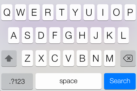
Remember that an ever growing percentage of visitors will be using a tablet device or a smartphone if you do not have a mobile version of your website. The search button needs to be big enough to click using a non-too-accurate finger tap or use form code to show the “search” button within on-screen keyboards such as the iOS7 example below:

2. Ensure the right results display for search queries (an easy fix on most ecommerce platforms)
Popular search queries
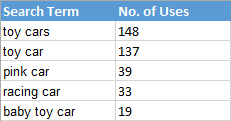
On many ecommerce platforms you can see the most popular queries used within your search bar, this gives you valuable insights on how people are trying to find what they want, for example:

Try searching yourself for each of these queries on your website; do they bring up the best results? Often than not the search results can be quite disappointing on ecommerce platforms, they bring up irrelevant products, miss out some products which should really be showing and sometime display zero results altogether!
The way to fix these bad results is sometimes located in the ecommerce admin area, some allow you to redirect search queries to a chosen product page, category page or custom URL.
If there isn’t this functionality on the ecommerce platform then standard 301 redirects can be used to redirect the search query URL (usually in the form “/search/result/?q=query”) to a chosen relevant URL on the website.
Typos and Misspellings
Accidental typos & misspellings can also ruin search results, they often occur so it’s important to test those out also or pre-empt what mistakes searchers may make.
3. Make the search bar more useful (a harder task for back-end developers)
It goes without saying that making your search bar more useful will have a big impact on visitors finding the right products and therefore make more purchases. Here are several ideas on how search bars can be modified to improve their usefulness:

Auto-complete
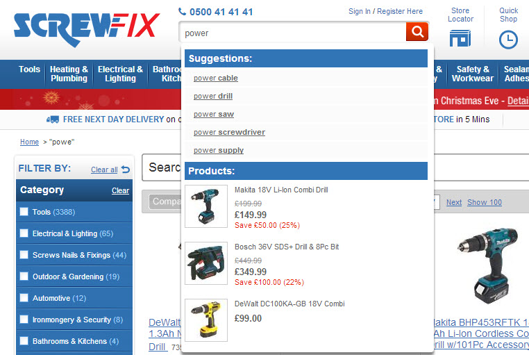
Auto-complete shows search suggestions when you start to type in a search query before you have even finished typing. Pre-empting what people are searching for has a few benefits such as:
- They can search more quickly
- They may avoid typos or misspellings by choosing a suggested query
- They can avoid typing too many characters into the keyword or smartphone making it easier
Dynamic Results
Whilst users search for products you can quickly display the top search results within the search bar itself. Making users click a link to see products is one extra step which they may not perform so this can improve conversion rates,
Categorised Results
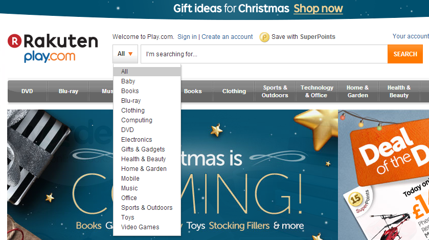
Before searching users may know that they are looking for a book, DVD or clothing for example, so it’s ideal to have filterable results which narrow the results down if your product range spans a lot of categories:

Conclusion
Whatever you decide to do with your ecommerce website it’s well worth spending a few minutes looking and testing out your search bar to make sure it’s not holding back any potential sales.
Just a small bit of work on your search bar can have a long term impact on your bottom line so it’s well worth looking in to today!

